
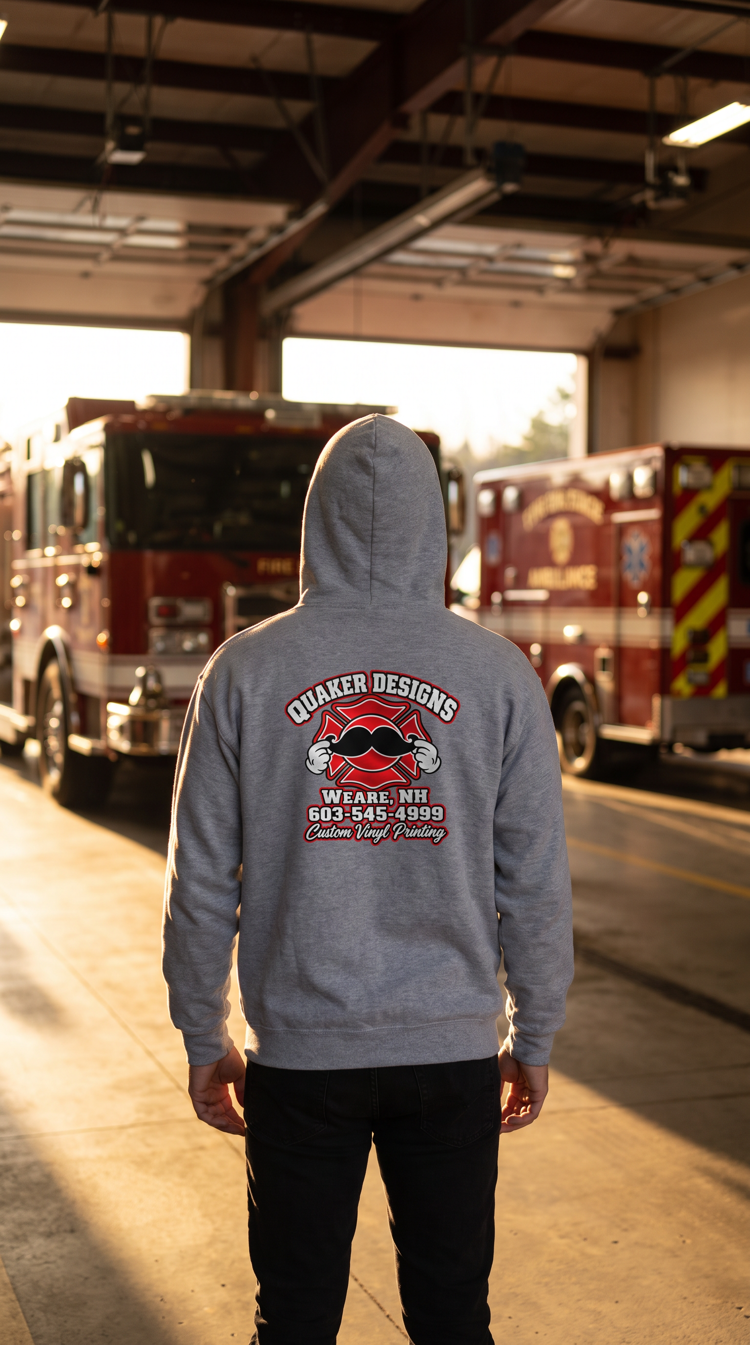

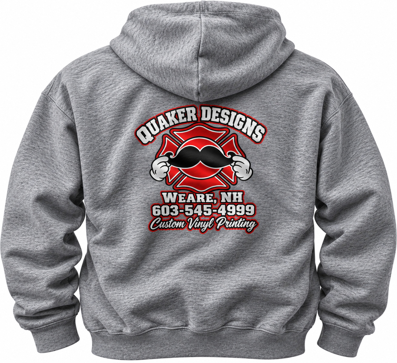
Quaker Designs introduces a bold new logo that captures who we are: family-owned, first responder operated, and fiercely community proud. Clean lines and a strong emblem fuse creativity with dependability—reflecting the same dedication and trust we bring to every project. The refreshed mark balances modern simplicity with a handcrafted feel, honoring our roots while signaling forward momentum. It’s more than a logo; it’s a promise to stand by our community, work hard, and design with purpose.
Quaker Designs introduces a bold new logo that captures who we are: family-owned, first responder operated, and fiercely community proud. Clean lines and a strong emblem fuse creativity with dependability—reflecting the same dedication and trust we bring to every project. The refreshed mark balances modern simplicity with a handcrafted feel, honoring our roots while signaling forward momentum. It’s more than a logo; it’s a promise to stand by our community, work hard, and design with purpose.